09/2011
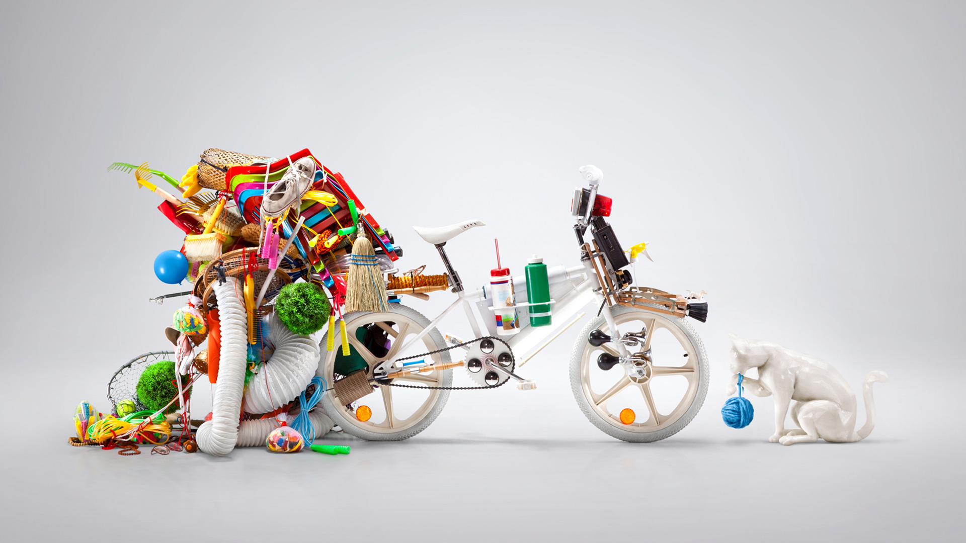
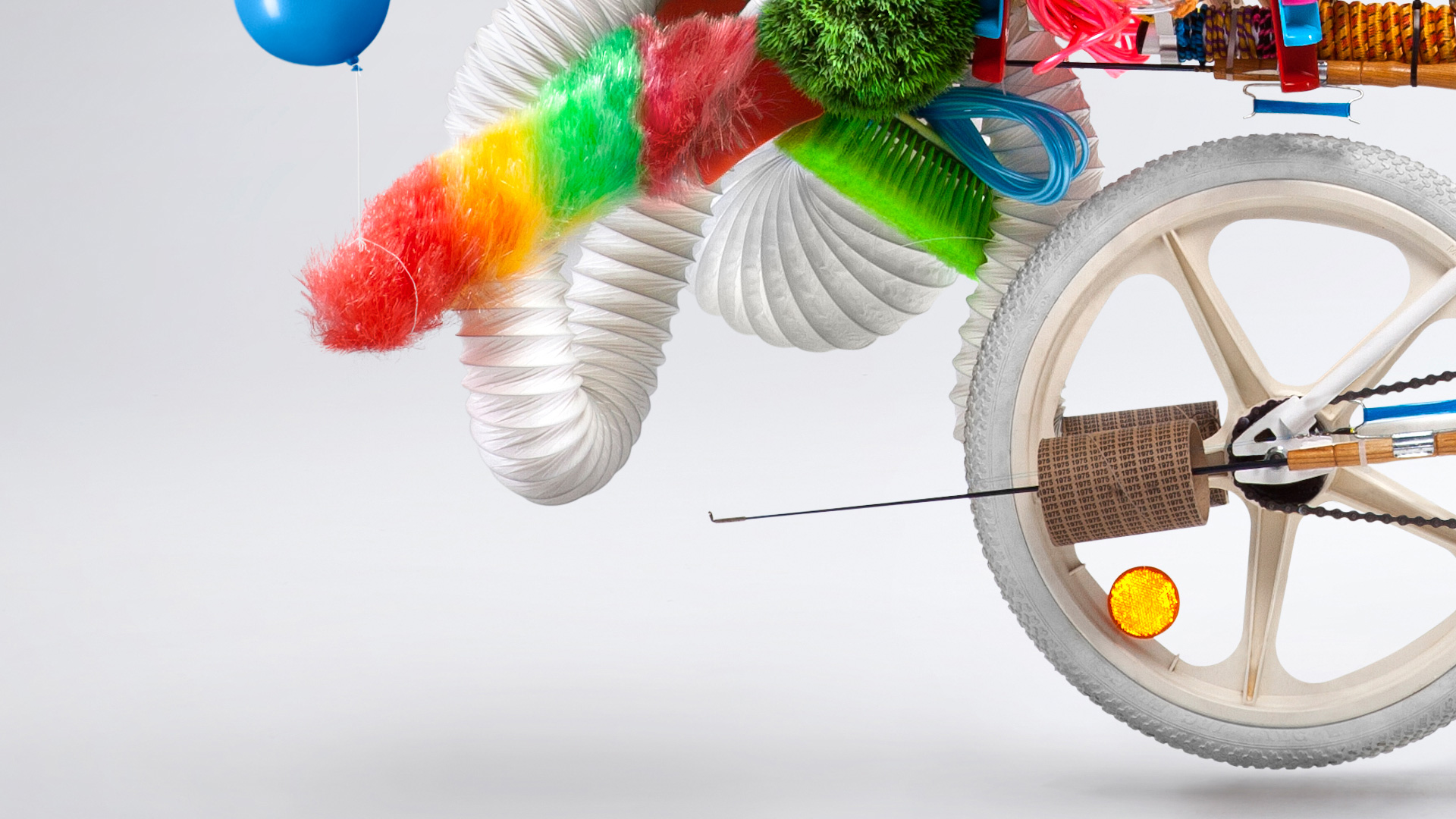
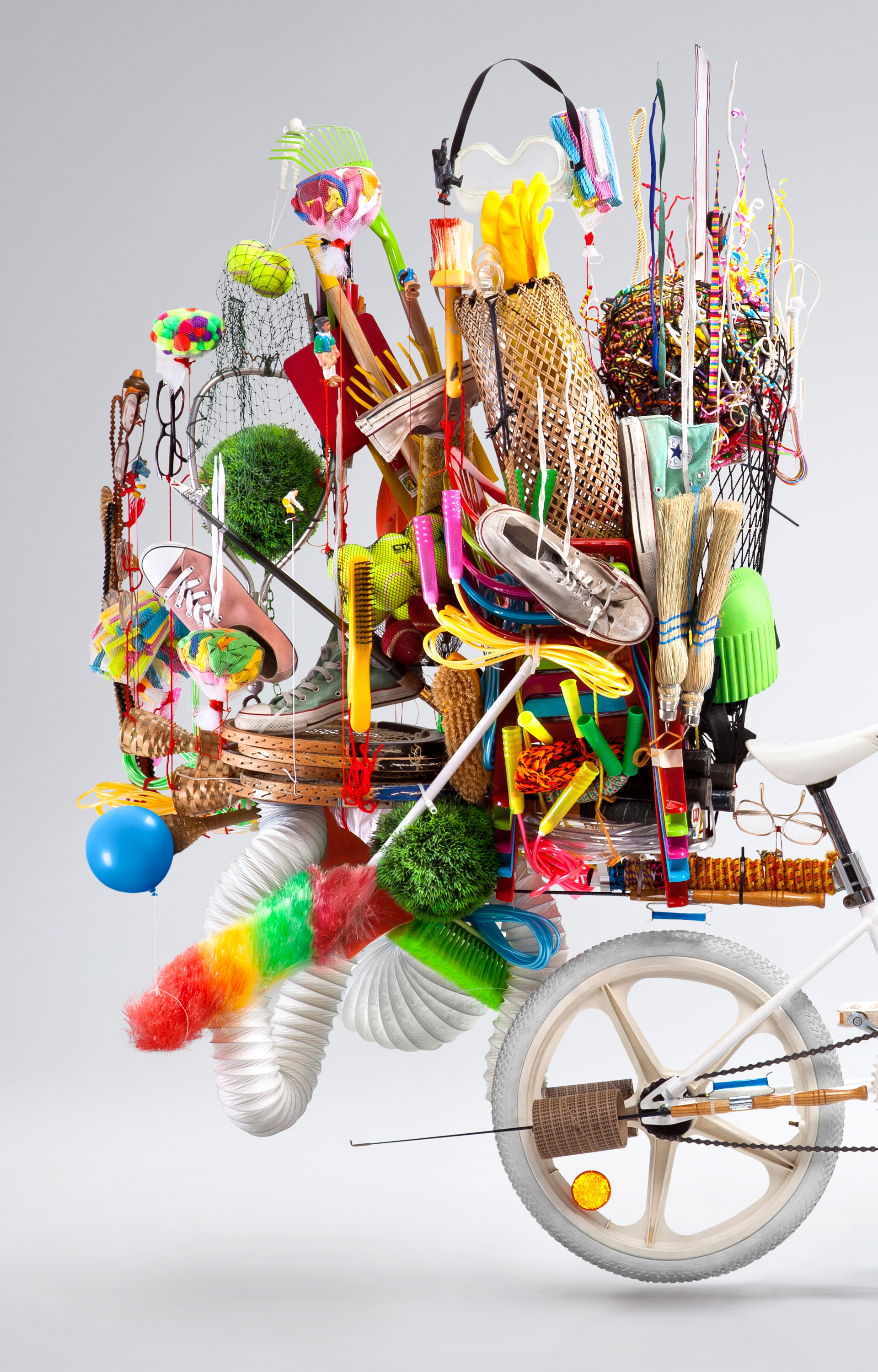
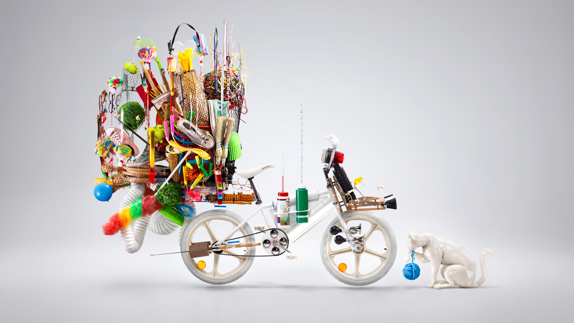
Yota is 4G network provider in Russia. They asked me to create a piece with the only demand of having two blue dots. The dots are part of their logo branding. I was inspired by the bicycle you see in Asia packed with stuff. Like a dollar store on wheels. I was also inspired by a small local trend in Mexico where kids "pimp" their BMX bikes. I mixed up those two inspirations and this is what I came up with. Then, I turned everything upside down, to make everything float!
Concept and design : Karim Zariffa
Photo : Simon Duhamel
Intern : Gabrielle Matte